The Stroop Effect
• Musings •
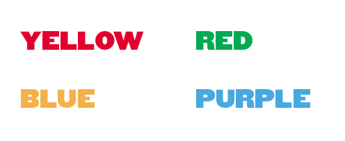
Just as good design supports the processing of information, bad design can slow us down. The Stroop test is an extreme example of bad design, but it’s illustrative. In the classic version, the written color name differs from the color ink it is printed in, and the participant must say the written word. In a variation of the test, the participant must name the ink color instead. In both cases, reaction time is slower and results are more error prone than if the ink and name match. Effective data presentation, where we use graphic visualization to emphasize information, speeds the acquisition of information and reduces the opportunity for misinformation. Test the Stroop effect for yourself.


